Case Study
Never the Same Combative Fitness
Brand identity design for a combative fitness company built around transformation, discipline, strength, and warrior-minded personal growth.
The Project
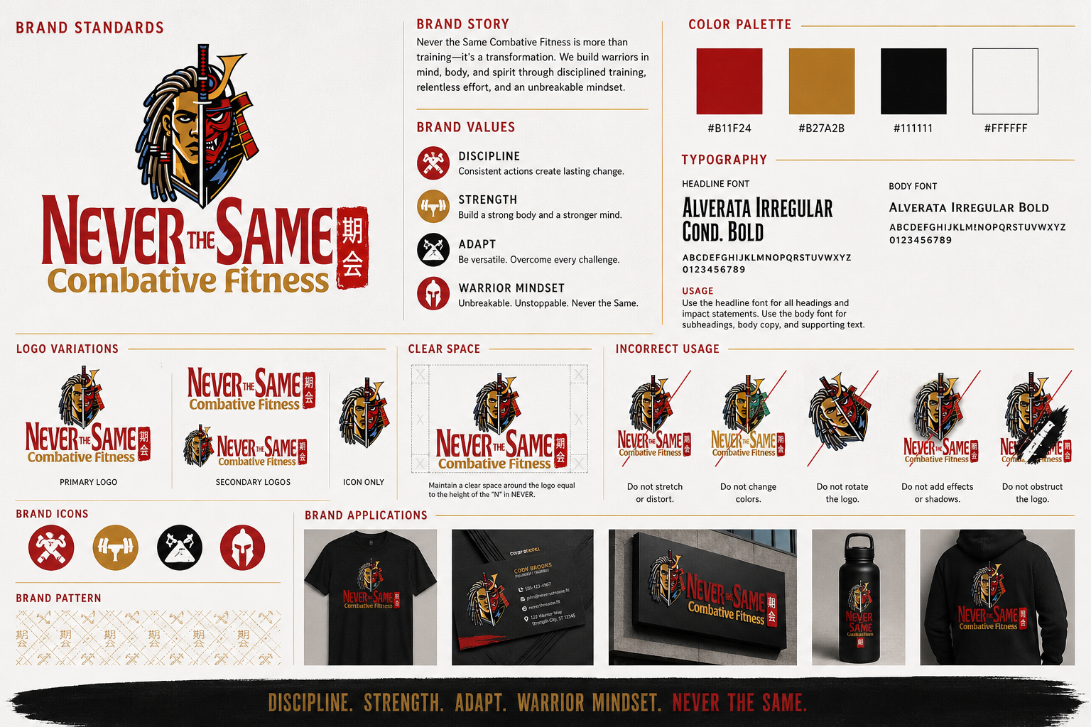
Never the Same Combative Fitness needed a bold visual identity that communicated strength, transformation, discipline, and a warrior mindset. The brand needed to feel intense and motivational while still looking professional and usable across print, apparel, signage, and digital marketing.
What We Delivered
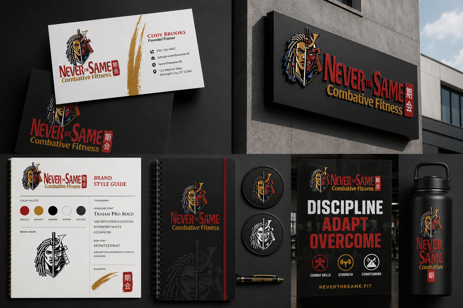
- Primary logo design
- Brand identity direction
- Color and typography direction
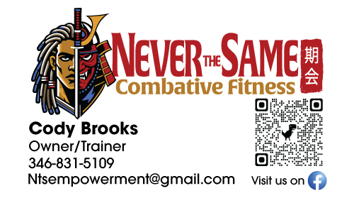
- Business card concept
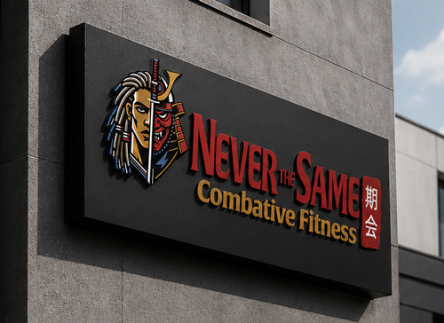
- Signage and apparel mockups
- Brand presentation imagery
The Visual Direction
The identity uses a powerful warrior transformation concept to represent personal change through combat training and fitness. The design direction is aggressive, masculine, and energetic, while still maintaining a clean brand system that can scale across multiple marketing uses.
Start a Project Like ThisProject Details
Client: Never the Same Combative Fitness
Service: Brand Identity Design
Industry: Fitness / Martial Arts
Date: August 2024
Brand System
A complete identity built for consistency.
The Never the Same brand system was designed to ensure consistency across all platforms, from print materials to apparel, signage, and digital marketing. The identity balances bold visual impact with a structured system for scalability.
Motion Graphics
Logo reveal animation
To extend the brand beyond static visuals, Ilfrey Media also created a logo reveal animation designed for video intros, social media content, promotional clips, and digital brand presentations.
- Animated logo reveal
- Video intro/outro use
- Social media-ready motion graphic
- Brand consistency across video content
Brand Identity
A bold identity built around transformation.
Brand Applications
Designed for real-world use.